The Problem
Traditional book covers and interiors for historical texts like The Noisy Renaissance by Niall Atkinson often rely on conventional imagery and muted color palettes, which can fail to capture the dynamic, bustling energy of Renaissance-era Florence. These conventional designs risk making the subject feel distant or overly academic rather than alive and immersive.
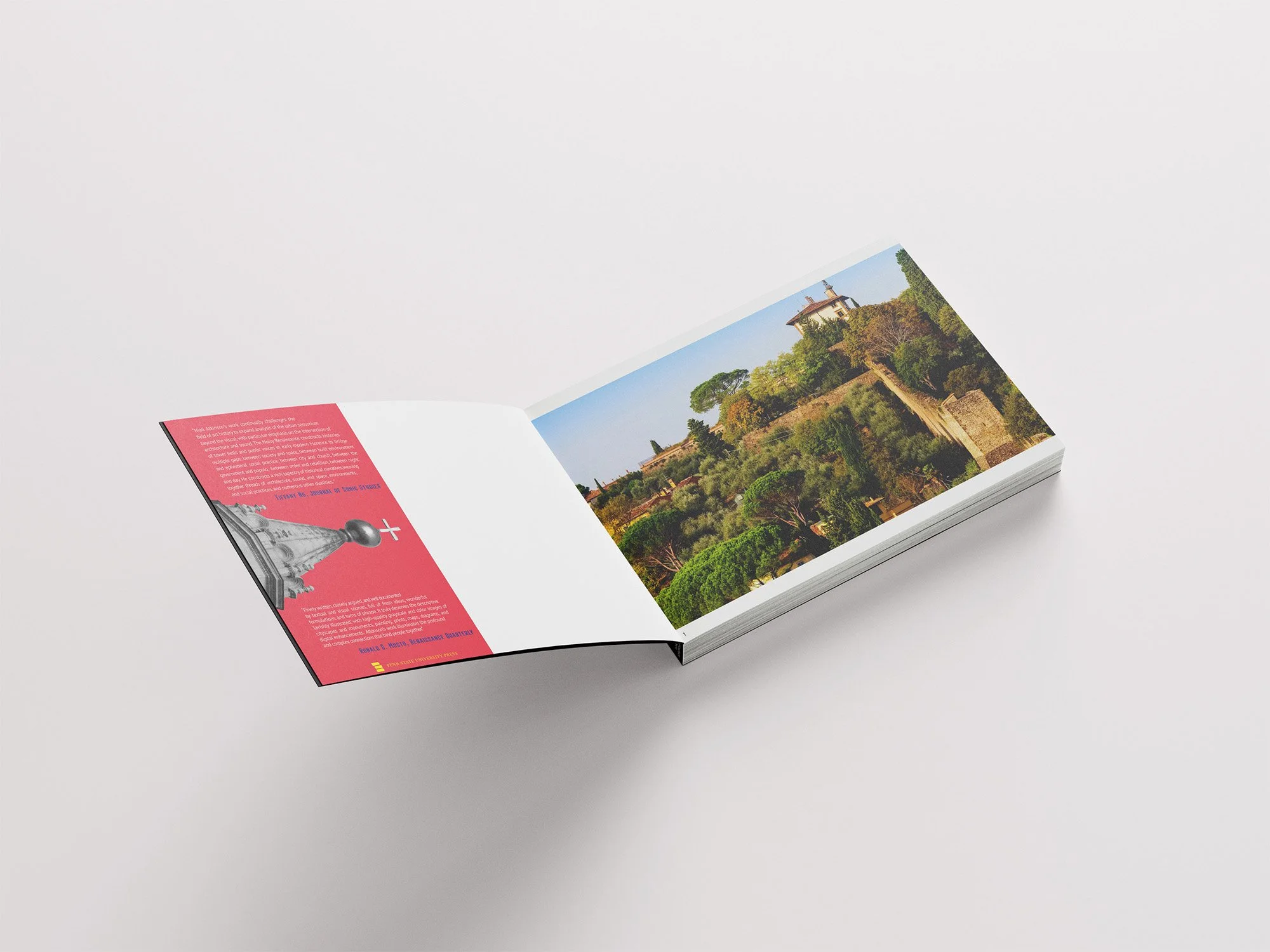
The Noisy Renaissance
The Solution
To break from tradition, this design reimagines The Noisy Renaissance by Niall Atkinson with bold typography and an unexpected color palette that reflects the chaotic, vibrant, and layered nature of Renaissance Florence. By using type as a primary design element, the cover and interior layout convey movement and sound visually, drawing readers into the era’s lively atmosphere while maintaining a strong, contemporary aesthetic.

Original Cover: A Conventional Approach
The original cover of The Noisy Renaissance presents a traditional, historically grounded design that seems a bit dark and mysterious. While it reflects the book’s academic nature, it relies on conventional imagery and subdued tones, which may not fully capture the energetic, chaotic spirit of the time in Renaissance Florence.